Harrington Homecare were a completely new business in need of an identity and a web presence. A small team of experienced individuals, the service Harrington Homecare offers was a high quality, personalised approach to home care and they wanted their new business website to represent that.
We worked initially with Harrington Homecare to come up with a unique logo which represented their values of high quality care. The logo comprises of two fonts; one for the name and a second for the service. Harrington is a serif, the goal being to suggest quality and respect. The capitalisation is clear and unambiguous. Homecare is clean, clinical, precise, and consistent, all qualities one would seek from a home care service. The Harrington name wraps around the Homecare title, suggestive of the safe and encompassing nature of the service, beyond expectation.

Following the completion of the logo, Harrington Homecare asked us to undertake the design of their website.
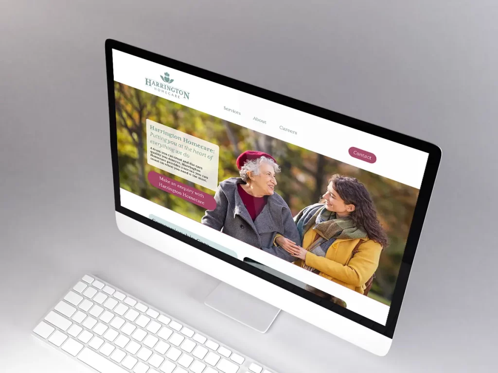
The aim of the site was to provide a positive first or second point of contact for potential service users of their families. The website should quickly communicate with users that Harrington provides a higher quality service than many others in the sector, with high levels of care and compassion in addition to professionalism.

Since Harrington Homecare was a new business at the time they did not have any photo content. We selected a number of images from reputable sources to represent the standards and values of the business, in addition to some recolouring of the photos to match the uniform colours.
The style of the new business website is deliberately soft and suggestive of empathy. Corners of elements are rounded, text is slightly larger, and sections are clearly defined. Text is arranged to be easily read and accessible.


